Mar 26, 2026
Why Figma Designs Never Quite Match the Final Product, and How AI Is Finally Fixing It
The gap between what a designer creates and what actually ships is one of those things that’s always felt inevitable. It isn’t. Tools like Claude Code and Figma MCP are starting to close that gap.
I want to describe a scene that will feel familiar to almost anyone who has worked on a product team.
A designer spends two weeks crafting a set of components in Figma. The colours are perfect. The spacing is deliberate. Every button state, every hover effect, every tiny label has been considered. Then they hand it off to a developer. The developer opens the file, does their best to interpret it, and ships something that is... close. The green is slightly wrong. The padding is off by four pixels. A font size that should have pulled from the shared style library got hardcoded instead.
Thanks for reading! Subscribe for free to receive new posts and support my work.
Nobody made a mistake. The designer did their job. The developer did their job. And yet the product drifted: quietly, invisibly, away from what was designed.
This is one of the most persistent, frustrating, and expensive problems in software teams. And for the most part, we’ve just accepted it as the cost of doing business.
I think that’s about to change.
The real problem isn’t communication. It’s translation.
The usual diagnosis is that designers and developers need to communicate better. More handoff meetings. Better documentation. More comments in the Figma file.
I’ve seen teams try all of this. It helps at the margins. But it doesn’t solve the underlying issue, which is that Figma and code are two fundamentally different languages, and every time a human translates between them, information gets lost.
Figma knows that a button background should be #22C55E. What it can’t easily tell a developer is that this colour has a name in the team’s shared library (success-green), that it maps to a specific role in the design system (button.background.success), and that using the hex value directly instead of that named reference means the whole system breaks if that colour ever changes.
A developer working from a Figma file has to make dozens of these micro-decisions per component. Most of the time, they get it approximately right. Sometimes they don’t. And those small inconsistencies compound over months and years into a codebase where nobody is quite sure which green is the “right” green anymore.
This is a translation problem. And it’s exactly the kind of problem AI is suited to help with, not by replacing the people involved, but by making the translation lossless.
What changes when AI can read both sides
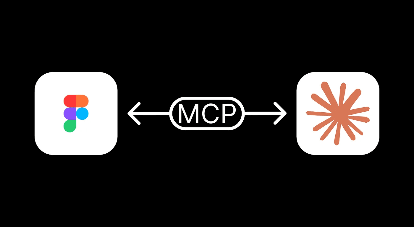
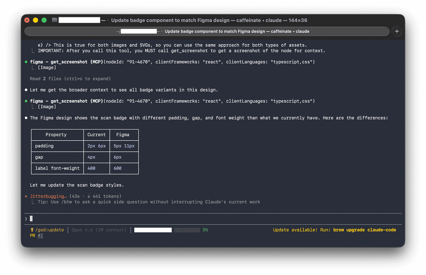
There’s a new approach emerging that connects AI directly to both Figma and the codebase at the same time. Instead of a developer manually interpreting a design file, the AI reads the Figma structure, its the components, the layout rules, the colour and spacing values, and cross-references it against the team’s existing code and shared style library.
The result is that instead of asking AI “build me a button component,” you’re effectively asking it: “Here’s what this component looks like in Figma. Here are the names our team uses for colours and spacing. Here are the other components we’ve already built. Make something that fits all of that.”
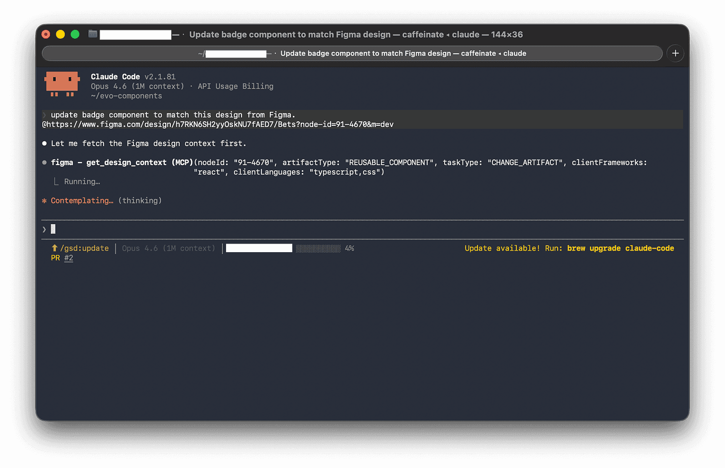
That’s a completely different request. The AI isn’t inventing anything: it’s translating with full context. And that context is what makes the output actually usable, rather than something that needs to be heavily rewritten before it goes anywhere near production.
When the AI spots a colour in Figma that doesn’t match anything in the existing style library, it doesn’t silently invent a new one. It flags it: this looks like it might be a new style — do you want to add it officially, or is this a mistake in the design file? That one behaviour alone could save hours of “why does this look slightly off?” debugging.
The hidden value of a shared naming system
Here’s the honest caveat: this workflow is only as good as the input you give it.
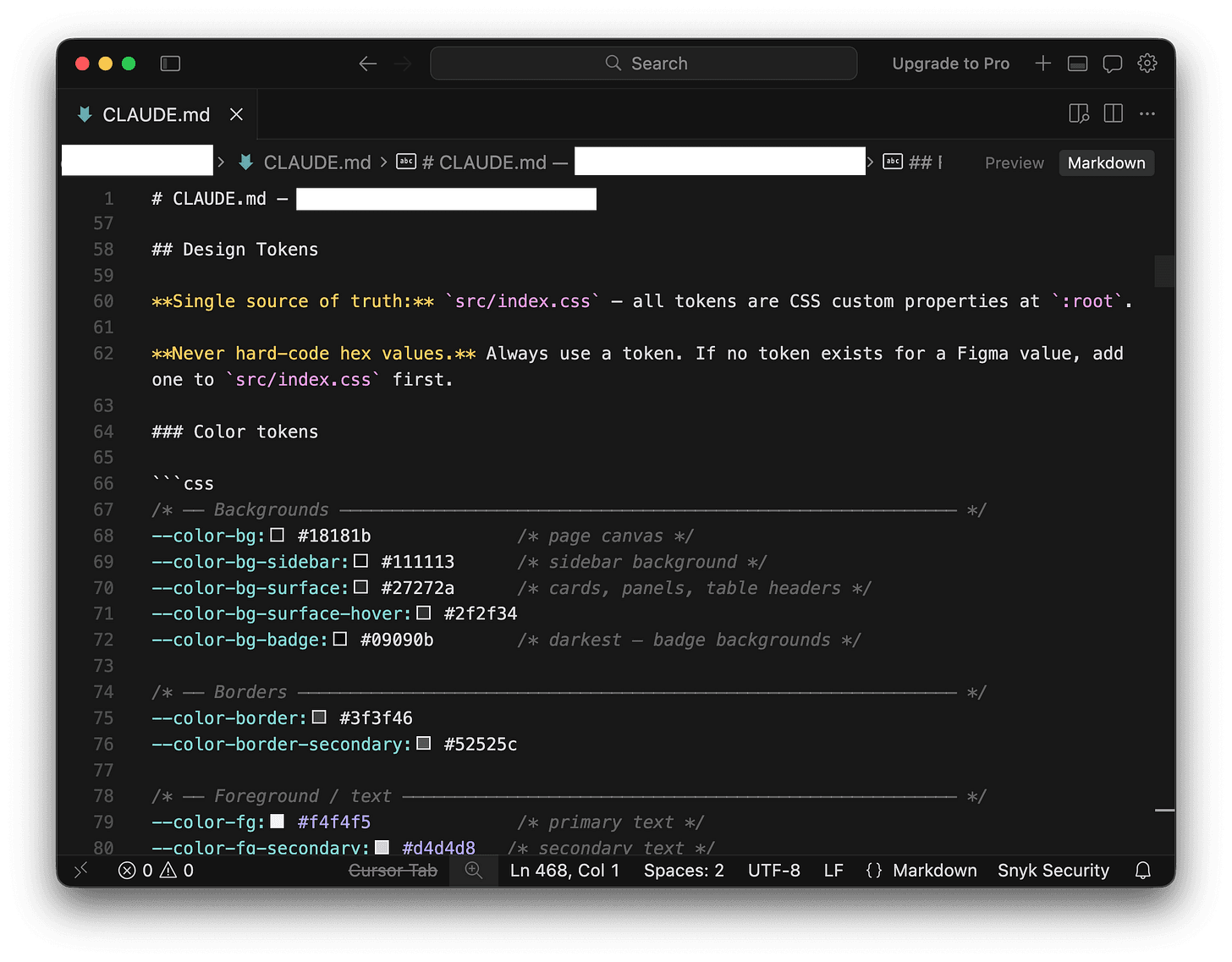
One concept that sounds a bit dry but ends up being fundamental here is design tokens, essentially a shared dictionary of names for every visual decision in Figma that can be carried straight into a Claude skill.
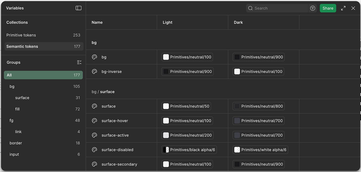
Instead of the same colour being called different things in different places, tokens give it one canonical name that everyone uses. In practice, that only works if they’re structured clearly in layers: a base level for raw values, a semantic level for meaning (like success states), and a theme layer for context (like dark mode).
That structure is what makes the system usable, it keeps things consistent, scales cleanly, and makes mapping into downstream systems like Claude straightforward rather than messy or ambiguous.
This sounds like a small thing. It is not a small thing. It’s the difference between a design system that holds together over time and one that slowly falls apart.
A practical Figma cleanup checklist:
All colours used need to be named colour styles (no one-off hex values in components), preferably using tokens.
All text styles are defined and applied consistently.
Components are named clearly and live in an organised library.
Spacing uses consistent values (8, 12, 16, 24 — not 9, 13, 17), preferably using tokens.
Component variants are grouped properly, not scattered across frames.
Three types of components, three different challenges
Different components have different failure modes in the design-to-code translation. Knowing which type you’re dealing with helps you brief the AI, and review its output, more effectively.
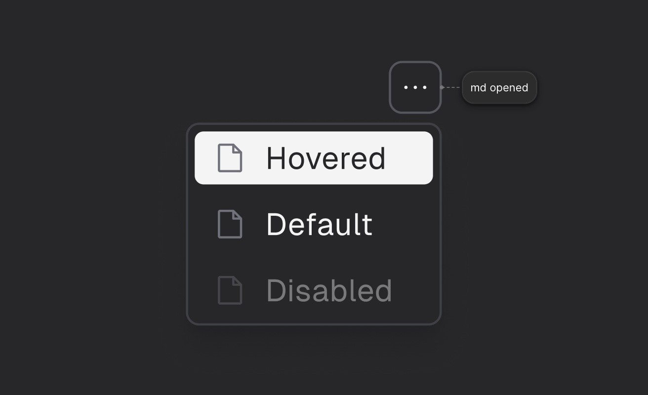
Small, reusable pieces (badges, tags, status labels)
These look simple but are deceptively tricky because they come in lots of variations. A single “badge” in Figma might be represented as eight slightly different objects: green for success, yellow for warning, red for error, in two sizes, with and without icons.
A developer working manually might build these as eight separate things. The AI, given the context of your existing component patterns, should recognise them as one component with configurable options. That’s the right outcome and it’s significantly easier to maintain.
What to check in the output: Are all the variants covered? Are they using your token names, not hardcoded colours?
Interactive components (dropdowns, menus, date pickers)
This is where Figma reaches its limits. It can show you how a dropdown looks when it’s open, and how each option looks when you hover over it. It can’t tell you how it should behave when someone uses a keyboard, or what a screen reader should say about it.
The AI has to fill in that behaviour from its general knowledge of how web interfaces work. Your job when reviewing is to make sure it’s done so correctly: keyboard navigation, focus handling, and accessibility labels are the things most likely to need a second look.
What to check in the output: Can you navigate it with just a keyboard? Are the accessibility labels sensible?
Layout components (cards, panels, sidebars)
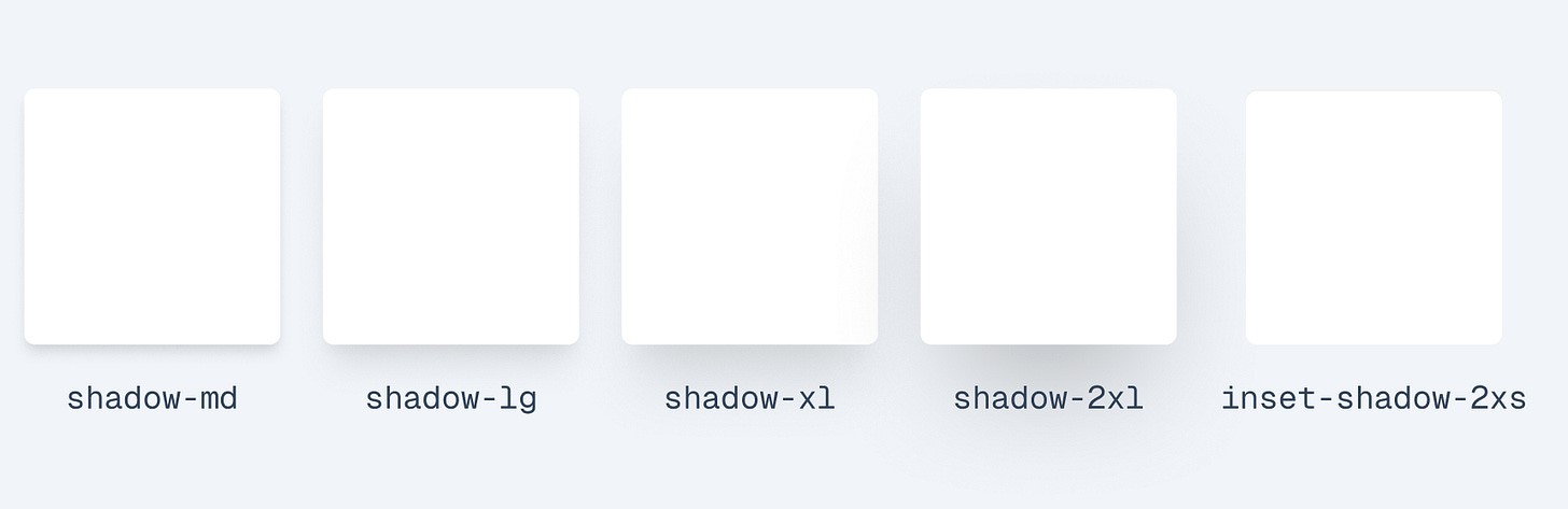
These are structurally simple but carry system-level implications. The padding inside a card, the roundness of its corners, the shadow it casts — all of these should pull from your token system, not be hardcoded. The risk here isn’t complex behaviour, it’s quiet inconsistency.
What to check in the output: Are spacing and visual values using named tokens or raw numbers?
Who owns the design? The answer is: both, sort of.
There’s a longstanding tension in product teams about whether Figma or code is the “real” source of truth. Designers point at Figma. Developers point at the repository. Both are right, and both are wrong.
A more useful framing: Figma owns the intent: how something should look, what states it has, how it varies. Code owns the reality: what actually runs, what’s accessible, what’s been tested.
The AI workflow I’m describing here respects that boundary. It treats the existing codebase as a set of constraints that Figma has to fit into. If a designer adds a new component in Figma that would require an entirely new pattern in code, the AI surfaces that as a decision that needs a human call, it doesn’t just barrel through and invent something.
In practice, this means design changes in Figma produce a clear, reviewable set of proposed code changes. Developers look at the diff, verify it makes sense, and approve or adjust it. The AI does the translation work; humans retain the judgment calls.
Over time, this also means the design file and the codebase stay in sync in a way that’s historically been very hard to maintain. When code gets refactored, it can suggest corresponding updates to the Figma library. When Figma drifts, it shows up as a flag rather than a silent divergence.
Can AI help us build things that hold together better over time?
Most conversations about AI in product development focus on speed. How quickly can we go from idea to working feature? That’s a reasonable thing to care about.
But I think the more interesting question is: can AI help us build things that hold together better over time?
The drift between design and code isn’t just annoying. It’s expensive. It erodes trust between designers and developers. It creates technical debt that’s invisible until it isn’t. It means that over time, the product stops looking like anyone intended.
A workflow that keeps design and code genuinely in sync — that makes the translation lossless, that flags inconsistencies before they compound, that keeps the shared vocabulary working — doesn’t just make individual components faster to build. It makes the whole product more coherent, more maintainable, and more honest about what was actually intended.
That seems worth working toward.
Original published at Substack